 EvenUs Home
Brand & identity · v1.0 · October 2026
A trusted friend who keeps the record. Not a bank.
EvenUs is the digital secretary for rotating savings circles. Every identity choice below serves one promise: the app should feel like a dependable member of the group, in the group’s own language.
What the brand stands on
Communal, never bank-like
Rotating savings is an act of trust between people who know each other. Warm greens, plain words and people’s names (not statements, IBANs or jargon) keep the product on the group’s side of the table.
Familiar before clever
Users are 30 to 60 year olds who already use WhatsApp. Lists, cards and single-column flows borrowed from apps they use daily mean nobody needs training.
One job per screen
Each screen answers one question first: what’s happening, what do I do next, who’s paid. Hierarchy does the explaining so copy never has to.
Status you can’t misread
Colour, icon and plain label always travel together. If someone can’t see lime, “Confirmed” still says confirmed.
Logo
The segmented emblem suggests a circle held together by its members: separate parts that make one shape. The approved lettering keeps the lockup confident at every size.
Primary lockup · light surfaces
EvenUsLockup · dark surfaces

Emblem · dark artwork on light surfaces
Emblem · light artwork on dark surfaces
Rules
- Clear space: keep at least the emblem’s height free around the logo.
- Minimum size: 32px tall for the lockup, 24px for the emblem alone.
- The emblem works alone as an app icon and favicon once recognised.
Never
- Don’t recolour the emblem outside the brand palette.
- Don’t stretch, rotate, add effects, or rebuild the lettering.
- Don’t place the logo on busy photography without a solid panel.
Colour
Two working hues and three neutrals. Every value below is a semantic token in the product, so screens re-theme together and nothing is styled by hand.
Hero surfaces, header, footer
A deep green reads as trust, growth and community instead of banking blue. It sits behind every screen and makes the lime stand out.
Primary actions, emphasis, progress
Warm and energetic rather than corporate. On the dark green it gives the strongest possible 'this is the next step' signal.
Secondary accents, receiving states
Calm and distinct from lime, so 'your turn to receive' never looks like a payment button. Cool against warm keeps the palette balanced.
Cards, reading surfaces
Maximum legibility for 30 to 60 year old readers on phones. Familiar, unhurried, no dark-mode strain.
Text and icon depth
Pure depth for type and line work; keeps contrast high without adding another hue.
Status colours carry meaning
Status tints are soft-background versions of green, amber and red, always paired with an icon and a written label. Colour is never the only cue.
Typography
Outfit for headings, Figtree for body. Both are rounded geometric sans-serifs in the spirit of Lufga: friendly at first glance, easy to read for a long time.
Display / Hero
Outfit ExtraBold · 44 to 60px
EvenUs
Screen title
Outfit Bold · 28px
Ada receives this month
Section heading
Outfit Bold · 20px
Who’s paid
Body
Figtree Regular · 17px
£200 confirmed for this cycle.
Label
Figtree Bold · 16 to 17px
Amount
Status / caption
Figtree Bold · 14px
Due 5 Oct
Body sits at 17px rather than 16px. It's easier to read with reading glasses and screens still feel normal.
Voice & tone
EvenUs speaks like the person who organises the group: warm, brief and specific. Financial-system language is banned from the interface.
EvenUs says
- Confirmed
- Still to pay
- Your turn
- Waiting for confirmation
- The pot
- Send £200 by 5 Oct
A bank would say
- Transaction settled
- Outstanding liability
- Beneficiary cycle allocation
- Payment in verification queue
- Aggregate contribution pool
- Initiate transfer before due date
Product UI principles
Components

Accessibility
- Minimum 48px tap targets, 3px visible focus rings.
- 17px body text, high-contrast pairings only.
- Status = colour + icon + label, always.
- Full reduced-motion support; motion is functional only.
Always
- Use the emblem with the approved EvenUs lettering. Don't redraw it.
- Pick the contrast-appropriate emblem for each surface.
- Keep one dominant message and one obvious next action per screen.
- Pair every status colour with an icon and a plain label.
- Keep body text at 16px or larger with 48px tap targets.
Never
- No coins, arrows, bank buildings or other money-cliché imagery.
- No gradients, glass effects, or purple 'fintech' clichés.
- No all-caps micro-labels or dense tables.
- Never make status depend on colour alone.
- No feeds, paywalls or social features. It's a record keeper, not a social network.
Photography
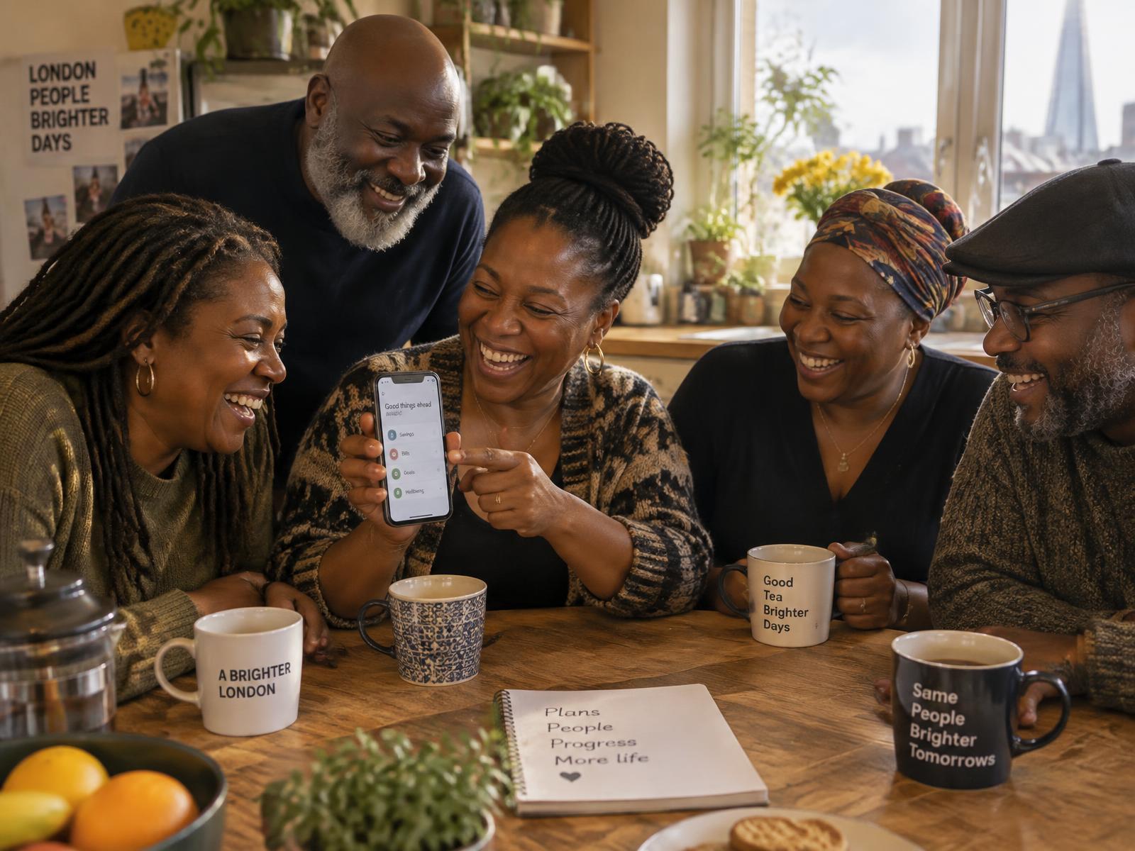
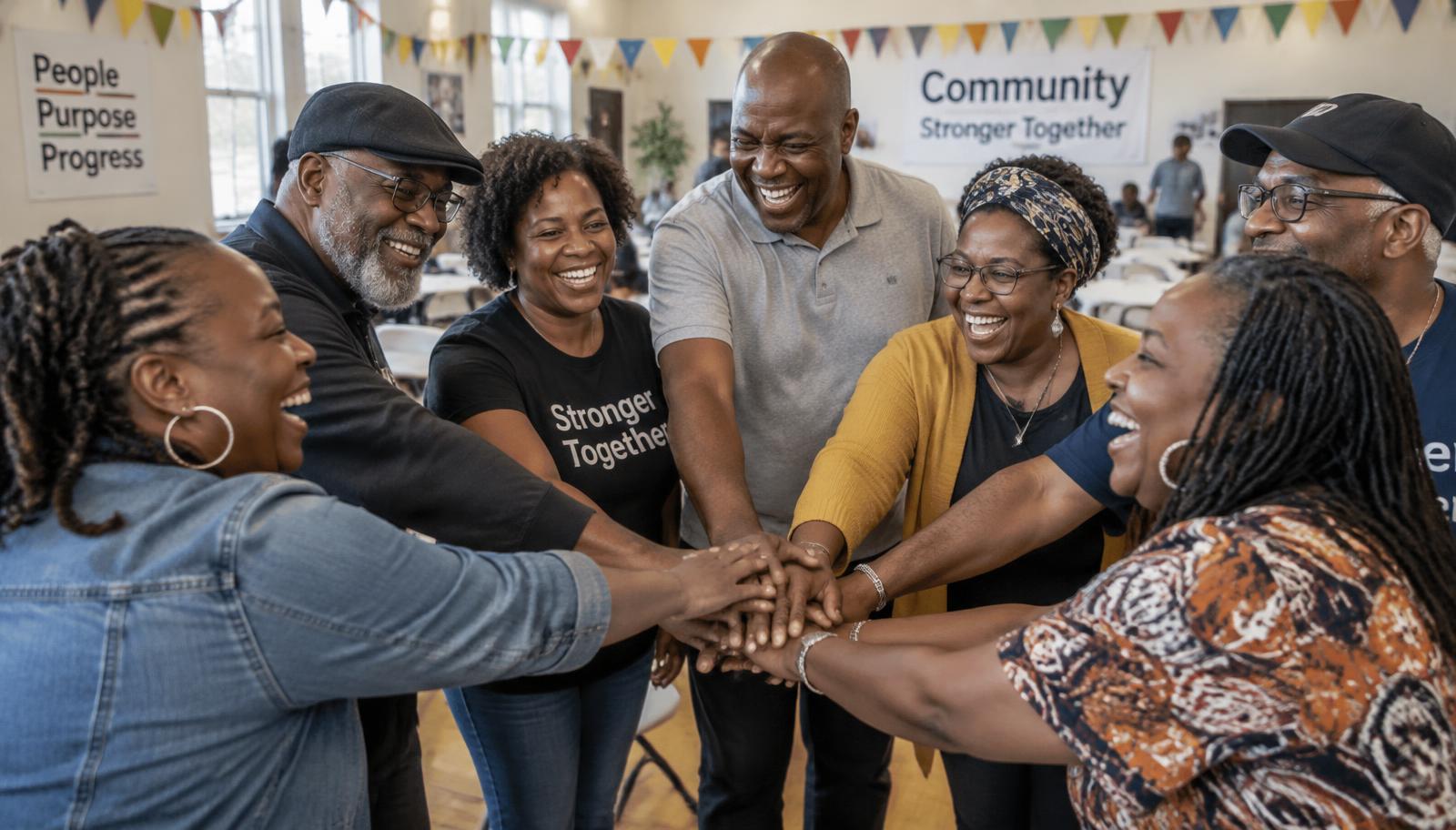
EvenUs belongs to the people who use it, so the photography shows them: Black British and African diaspora communities, aged 30 to 65, in real homes and community halls. Warm natural light, candid joy, nobody posing for a camera.
Always
- Real people aged 30 to 65, reflecting the members
- Candid laughter and everyday moments: tea, phones, kitchen tables
- Warm natural light and real settings: homes, halls, streets
- Portraits that feel like a friend took them
Never
- Stock-photo stiffness: suits, handshakes, forced smiles
- Bank-style imagery: skyscrapers, briefcases, graphs
- Cash, coins or cards as the hero: money is not the product
- Anyone who looks like a model rather than a member
The line we don’t cross
EvenUs never holds, moves or verifies money. There are no wallets, no payment processing, no investment products and no score that ranks members. “Paid” means a person in the group confirmed it arrived. A human promise, recorded.
That boundary is the brand. Every visual choice keeps the app in the role of helpful secretary: present, organised, and firmly not in charge of anyone’s money.